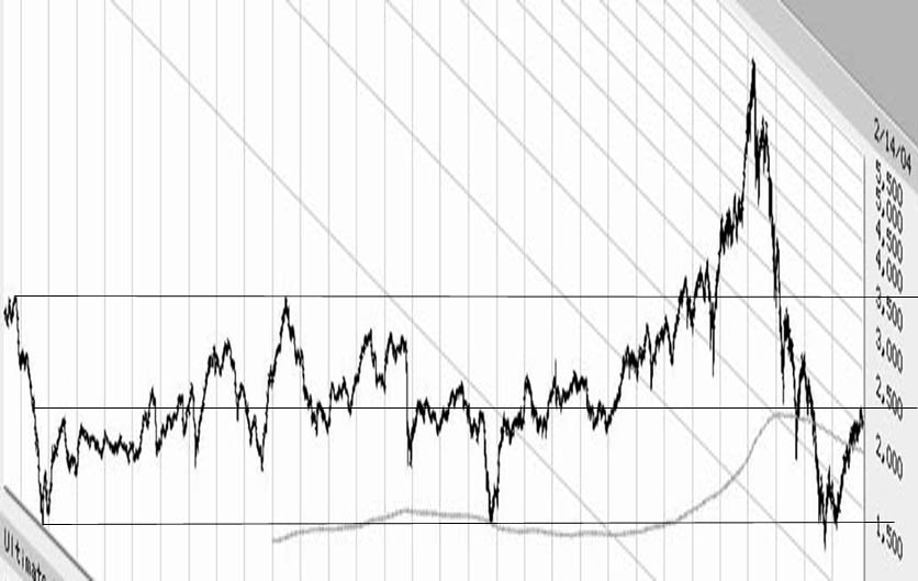
This was a fun little graphic manipulation. Took the 30-year chart of the Nasdaq composite on a logarithmic scale. Digitally sheared the image to bring the long-term uptrend to a flat horizontal orientation. From this, one can draw straight horizontal lines connecting upper and lower extremities of said index representing maximal deviations from the long-term trend centerline. If I've even drawn it roughly right, the Nasdaq's current position is right around that center trendline right now. What this would imply is that the rally of the last year has now fully relieved the deeply oversold condition of late 2002. Similar past oversold bottoms and recoveries in 1973-74 and 1990-91 were followed by corrections, one sharp (1974) and one barely perceptible (1991) before continued rallying. The recent rounded 'humping' pattern being generated by the nasdaq last few weeks has been relieving the overbought condition of the rally like air being let ever so slowly out of a tire. There may be a correction in the offing even so, but it's hard to count on it happening at this point. The market could simply asymptotically 'revert to the mean' onto the center trendline.
Attached Image: