
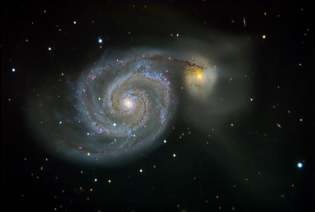
I am still spending too much time processing, so I should at least ask for feedback along the way. At least processing is something to do during all the recent rain. This may be the end of this M51 for a while, depending on your feedback to the following processing choices...
Fewer color subs - This version removed the "moon" RGB subs, and that appears to have fixed the weird gradients that I couldn't quite deal with in software. Still have 35 minutes each.
More contrast - Rather than continuing to fumble with curves, I just cranked the contrast slider over more than I normally would. Looking at other on-line shots, the ones with higher contrast seem to "jump out" more. Is this too much?
More sharpening - Again, more than I think looks "natural," but the result pops a bit more. Several iterations of unsharp mask here. I tried to be selective with stars, but I am sure I need more practice with that. Too much? (I have yet to do a "de-convolution" I like.)
More saturation - Once again more color than I personally like, but showing this to a few non-astro people, they like the vivid colors better. Again, too much?
Smoother background - With a Carboni action. I think it removes some of the faint background galaxies, but is the smoothness more visually pleasing?
Any comments and suggestions would be appreciated.
Thanks,
Charlie
Fewer color subs - This version removed the "moon" RGB subs, and that appears to have fixed the weird gradients that I couldn't quite deal with in software. Still have 35 minutes each.
More contrast - Rather than continuing to fumble with curves, I just cranked the contrast slider over more than I normally would. Looking at other on-line shots, the ones with higher contrast seem to "jump out" more. Is this too much?
More sharpening - Again, more than I think looks "natural," but the result pops a bit more. Several iterations of unsharp mask here. I tried to be selective with stars, but I am sure I need more practice with that. Too much? (I have yet to do a "de-convolution" I like.)
More saturation - Once again more color than I personally like, but showing this to a few non-astro people, they like the vivid colors better. Again, too much?
Smoother background - With a Carboni action. I think it removes some of the faint background galaxies, but is the smoothness more visually pleasing?
Any comments and suggestions would be appreciated.
Thanks,
Charlie
Attached Image:
Fort Lewis Observatory: (37.238, -108.052) ~2360m (7744 ft.) elevation.
Darkness - typically 6.5+
Scope - Meade 16" LX200; f6.3 focal reducer
Focus - JMI Smart focus
Camera - SBIG ST-10XE; (~.5"/pixel)
Guiding - AO-8 and/or Meade 5"/DSI/PHD
http://www.fortlewis.edu/observatory