Image of the day

Captured by
Shane Yarnall

LDN 1622

My Account

New to Astromart?

Register an account...

Need Help?

Rosette Reprocessed

Started by Rob Mackie, 01/03/2008 06:28PM
Posted 01/03/2008 06:28PM Opening Post
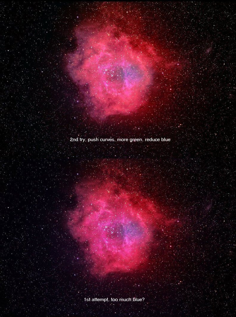
I played with the Rosette last night, stretching more aggressively and going heavier on green. Here's a comparison and I invite your comments. I'm not sure if I like it any better than the first one.

Rob Mackie
Attached Image:

Rob Mackie's attachment for post 40301
Posted 01/03/2008 07:38PM #1
Here's a well colored Rosette to guide you, Rob:
http://www.caelumobservatory.com/gallery/rosetteabtp.shtml

dan kowall
photonhunter.com
Posted 01/03/2008 09:54PM #2
Rob,
Totally subjective, but I do like the revised version better. I think this might be due to the curves as much as color, but it seems to have more contrast between the colors, with nice distinction between the blue tones. Also seems like you've gotten back some red in the middle. The contrast almost has a narrowband feel to it. Great image either way, but I'll vote for the revision smile
Larry
Posted 01/04/2008 02:15AM #3
Hi Rob,

Guess what? I actually prefer the first one. Oddly enough, at least to my eyes the second version looks a bit pushed too hard. After looking at Adam's rendition, I'm thinking you're pretty darn close with version 1!

Eric